Visualization · Conventions
Figure conventions
Every figure in this documentation — the system catalogue pages, the analysis results, the examples throughout the visualization section — follows one small, consistent set of rules. They are not decoration. Perceptually uniform colormaps, a disciplined accent palette, honest colorbars, and one idea per figure are what make a plot readable in a paper — legible in greyscale, safe for colour-blind readers, and truthful about magnitude.
This page is the house style, so your figures can match it. The mechanics for
applying any of this — .recolor, .style, .theme, .grid — live in
styling & themes; here we cover what to choose and why.
The one rule: colour encodes meaning
Colour is a data channel, not ornament. The choice of colormap should follow the kind of quantity being shown, because the human eye reads different maps in different ways.
| Quantity | Colormap | Why |
|---|---|---|
| A sequential scalar field — a spacetime image, a 2-D reaction–diffusion field, elapsed time along an orbit | viridis | perceptually uniform (equal data steps look equal), monotone in lightness (survives greyscale printing), colour-blind safe |
| A cyclic / phase quantity — an angle, a phase, a periodic coordinate | twilight | wraps back to its start, so 0 and 2π read as the same colour (a sequential map would show a false seam) |
| A spectral density (a spectrogram) | magma on a log norm | high dynamic range, dark-to-bright reads as low-to-high power |
| A categorical label — basins of attraction, attractor ids | tab20 (discrete swatches) | distinct hues, no false ordering between unrelated categories |
| A binary mask — a recurrence plot | binary | ink-on-white, maximal contrast for a black/white structure |
These are the library's built-in per-kind defaults — a SPACETIME /
SPATIAL_FIELD / IMAGE renders viridis, a BASINS_IMAGE renders tab20, a
RECURRENCE_PLOT renders binary, a SPECTROGRAM renders magma with a log norm —
so you usually get the right map for free. Override with cmap= only for a
deliberate reason.
Never use a rainbow (jet) colormap
jet and its relatives are not perceptually uniform: they invent
contrast where the data is flat (the cyan/yellow bands) and hide it where the
data changes, they are unreadable in greyscale, and they are hostile to
colour-blind readers. Every quantitative figure in this project uses viridis
or a sibling for exactly this reason. If you find yourself reaching for a
rainbow, reach for viridis instead.
The brand palette is sampled from the colormaps
The two TSDynamics accent colours are not arbitrary — they are sampled from the house colormaps, which is why line plots and field images sit together harmoniously:
- Teal
#11857A— the primary. It is viridis at ≈ 0.50 (its green-teal middle). Use it for the main trace, the object of interest, links and marks. - Indigo
#574FCF— the accent. It is twilight at ≈ 0.30. Use it for a second series, integrator state, highlights, the "other" thing in a comparison. - Amber
#ffb000— a warm highlight for a moving head, an event marker, a reference value against a cool field. Reserved for the one thing the eye should land on.
import tsdynamics as ts

lor = ts.systems.Lorenz(ic=[1.0, 1.0, 1.0]).run(final_time=100, dt=0.01)

ts.plot(lor, components=["x", "z"]).recolor("#11857A")   # the house teal
When two traces are compared, teal-then-indigo is the default pairing (small thing teal, big thing indigo, or reference teal, perturbed indigo). For three or more, fall back to a full themed palette rather than hand-picking hues.
Type: IBM Plex, and label everything
Labels are set in IBM Plex Sans (body) and IBM Plex Mono (values and code) to match the documentation. Every axis carries a label, and a scalar colour channel carries a colorbar with a label — an unlabelled axis or an unlabelled colour ramp is an unfinished figure.
(
    ts.plot(lor, components=["x", "z"], color_by="time")
       .relabel(x="x", y="z", title="Lorenz (x, z)")   # axes + title
       # a color_by= channel grows a labelled colorbar automatically
)
The variables a system declares (Lorenz's ('x', 'y', 'z')) become the axis
labels for free, so a portrait of named components is self-documenting. For a
manuscript, the publication theme switches to a serif face and larger type;
see themes.
One figure, one concept
A figure should make exactly one point. The catalogue holds to this strictly:
- The attractor's shape → a clean 3-D phase portrait with
.style(axes=False)— no ticks competing with the geometry. - A comparison → an overlay (two orbits on one plane, teal vs indigo) or a small-multiples grid (one system per panel) — never both crammed into a single busy axes.
- A spatiotemporal field → a spacetime image with a colorbar, not a tangle of 20 overlaid line plots.
When a figure wants to say two things, make it two figures (or two panels). The
ts.plot(..., layout="grid" | "row" | "stack") composer exists precisely so
that "several related views" is panels, not clutter.
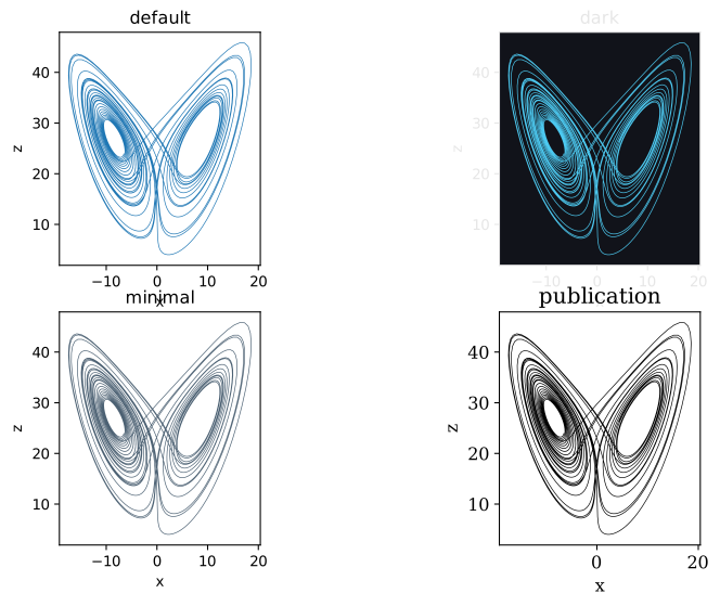
(x, z) portrait under the four built-in themes, tiled with ts.plot(layout="grid"). A theme is a coherent set of conventions — palette, background, font, grid — applied at once; publication (serif, colour-blind-safe palette, larger type) is the one to reach for when the figure is bound for a journal.Colorbars and legends
- A scalar colour channel always gets a colorbar. A
color_by=line, a spacetime image, a 2-D field — each grows a labelled colorbar and an inferred colour range (clim) automatically, so the mapping from colour to value is never left implicit. - Two or more labelled layers get a legend. A single-trace figure does not — the axis labels already say what it is. An overlay disambiguates its legend by source automatically.
- Fix the colour range across a comparison. When two panels image the same
quantity, set the same
clim=on both so their colours are comparable — otherwise each auto-scales independently and the colours lie about magnitude.
# a shared colour range across two field panels, so the colours mean the same thing
ks = ts.systems.KuramotoSivashinsky(N=64, L=22.0)
spec_a = ts.plot(ks, final_time=100.0, dt=0.5, ic=None)
spec_b = ts.plot(ks, final_time=200.0, dt=0.5, ic=None)

spec_a.colorize(clim=(-12.0, 15.0))
spec_b.colorize(clim=(-12.0, 15.0))
Transparency and output format
- Vector for line art, raster for fields. A phase portrait or time series is
line art — save it as
.pdfor.svgso it scales crisply in a manuscript. A dense spacetime image or a high-resolution field is better as a.pngat a publicationdpi(300+)..save(path)picks the backend from the extension; set resolution with.size(dpi=300)orsave(..., dpi=300). - Transparent backgrounds let a figure sit on any page or slide colour. The documentation figures are transparent; for your own, leave the background unset (the default) rather than baking in white, unless the publication theme's explicit white is what you want.
A paper-ready recipe
Putting the conventions together — a colour-blind-safe portrait, labelled, on a serif publication theme, exported as a vector:
import tsdynamics as ts

lor = ts.systems.Lorenz(ic=[1.0, 1.0, 1.0]).run(final_time=100.0, dt=0.01)

(
    ts.plot(lor, components=["x", "z"], color_by="time")
       .theme("publication")          # serif, Wong colour-blind-safe palette
       .relabel(x="x", y="z", title="Lorenz attractor")
       .gridlines(alpha=0.3)
       .save("lorenz-figure.pdf")      # vector output for a manuscript
)
For a whole document, set the theme once globally so every figure matches
without repeating .theme(...):
ts.viz.themes.use("publication")   # every subsequent plot uses it
# ...and when you are done with that document:
ts.viz.themes.use("default")
Checklist
Before a figure leaves the notebook for a paper:
- Colormap matches the quantity — viridis sequential, twilight cyclic, tab20 categorical, never a rainbow.
- Every axis is labelled; a colour channel has a labelled colorbar.
- The figure makes one point; a second point is a second panel.
- Compared panels share a
clim=so colours are comparable. - Line art is vector (
.pdf/.svg); dense fields are raster at 300+ dpi. - The publication theme (or an equivalent colour-blind-safe palette) is on for journal output.
See also
- Styling & themes — how to apply all of the above.
- Plotting — the front door — building the figure in the first place.
- System catalogue — every page is a worked example of these conventions.